How to Optimize Shopify Bookings for Mobile Customers
How to Optimize Shopify Bookings for Mobile Customers
A wellness center in Boston redesigned its Shopify store with a beautiful desktop layout: large hero images, wide service descriptions, and a booking widget that looked perfect on a 14-inch laptop screen. The owner, Priya, tested the booking flow on her desktop, loved it, and published. Two weeks later, she pulled her Shopify analytics and discovered that 71% of her booking page visitors were on mobile devices. She opened her own booking page on her iPhone and found the experience was terrible: the service descriptions were cut off, the time slot selector required horizontal scrolling, the "Book Now" button was partially hidden behind a sticky navigation bar, and the confirmation email was nearly unreadable on a 5-inch screen. She estimated that 30% to 40% of mobile visitors abandoned the booking flow before completing it. At $100 per session, that was potentially $2,000 to $2,400 per month in lost bookings from a broken mobile experience.
Mobile-friendliness is not a design preference. It is the primary booking channel for the majority of your clients. If your booking flow does not work perfectly on a phone, you are losing the majority of your potential revenue. Here is how to audit, fix, and optimize your Shopify booking experience for mobile.
The data is unambiguous. Over 65% of e-commerce traffic comes from mobile devices, and for service businesses with local clientele, the number is often higher. A 2025 report by Google found that 58% of "near me" searches are conducted on mobile, and 76% of people who search for a nearby service on their phone visit a business within 24 hours. The phone is not just a browsing device. It is the booking device.
Baymard Institute research shows that the average mobile cart abandonment rate is 70.1%, compared to 68.3% on desktop. For booking flows specifically, the gap is wider: mobile booking abandonment rates average 75% to 80% because the booking flow typically requires more precision (selecting exact time slots, entering details) than a simple product purchase. Every friction point that a desktop user can tolerate (small text, extra scrolling, confusing layout) causes a mobile user to abandon.
Your clients are not sitting at a desk when they decide to book. They are on the subway, in a waiting room, during a lunch break, or lying in bed at 11 PM. A booking flow that requires a desktop experience excludes every moment that a client is not at their computer. Mobile-friendly means the client can book from any context, in any position, with one hand and a thumb.
Since 2018, Google has used mobile-first indexing, which means Google primarily uses the mobile version of your page for ranking. If your booking page is not mobile-friendly, it ranks lower in search results, which means fewer visitors find you in the first place. Mobile-friendliness affects both conversion rate (visitors who book) and traffic volume (visitors who find you).

If a client has to pinch and zoom to read your service descriptions, pricing, or booking details, they will not. Body text should be at least 16px on mobile. Headings should be proportionally larger. Cowlendar's booking widget uses responsive typography that scales automatically to mobile screen sizes.
A horizontal scrolling time picker on a 5-inch screen is frustrating. The client has to swipe left and right to find their preferred time, and they often miss the slot they want. The ideal mobile time selector uses a vertical list of time slots that the client can scroll through naturally. Cowlendar's mobile booking widget uses a vertical time slot layout that works with natural thumb scrolling.
The minimum recommended touch target size is 44x44 pixels according to Apple's Human Interface Guidelines. If your "Book Now" button or time slot buttons are smaller than this, clients will misclick, hit the wrong time, or give up entirely. Cowlendar's booking widget uses touch targets that meet or exceed the 44x44 minimum across all interactive elements.
When a client taps on a phone number field, their phone should display the numeric keypad. When they tap on an email field, it should display the email keyboard with the @ symbol. If your booking form does not use the correct input types, the client has to manually switch keyboards, which adds friction. Cowlendar's intake form fields use the correct HTML input types for each field.
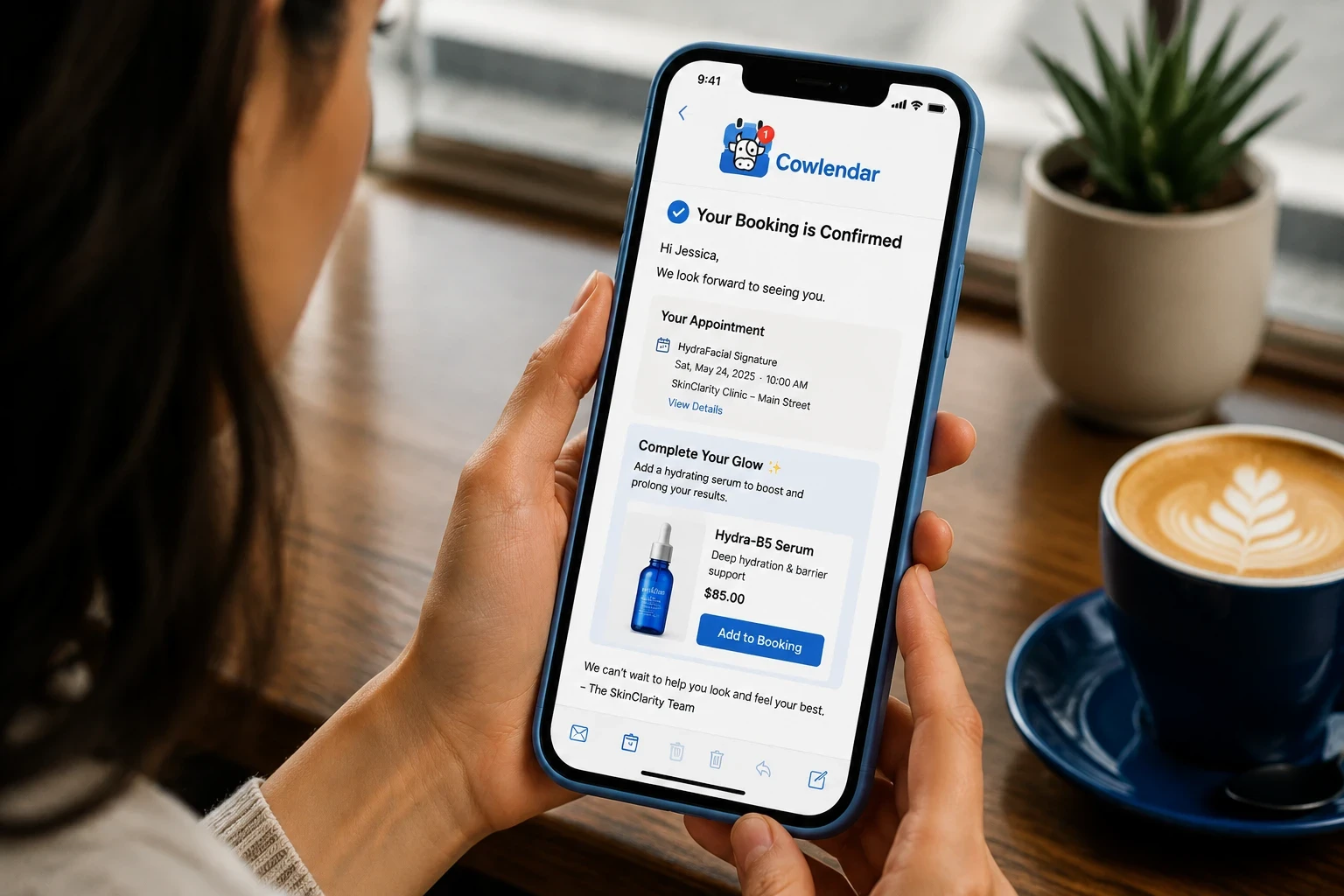
A confirmation email designed for desktop (multiple columns, small text, wide images) looks broken on a phone. The client opens the confirmation, sees a jumbled layout, and does not trust that the details are correct. Design confirmation emails for mobile-first: single column, large text, clear hierarchy, and a prominent rescheduling link. Cowlendar's confirmation email templates are responsive and render correctly on all mobile devices.
A sticky header or navigation bar that covers 60 to 80 pixels of the top of the screen is common on mobile Shopify stores. If your booking widget starts at the very top of the page, the sticky nav covers the first service or the first interactive element. Add padding or margin above the booking widget so it appears below the sticky nav on mobile.
A booking widget that takes more than 3 seconds to load on a mobile network loses 53% of visitors according to Google research. Mobile networks are slower than desktop broadband, and mobile users are less patient. Cowlendar's booking widget loads asynchronously, which means the page content loads first and the widget appears within 1 to 2 seconds without blocking the rest of the page.
Open your booking page on an iPhone (Safari), an Android phone (Chrome), and a tablet (iPad or Android tablet). Walk through the entire booking flow on each device: browse services, select a time, enter details, confirm the booking, and check the confirmation email. Note every moment where you have to zoom, scroll horizontally, or struggle to tap a button.
Use Google PageSpeed Insights (pagespeed.web.dev) to test your booking page on mobile. The tool provides a mobile-specific performance score and identifies specific issues: unoptimized images, render-blocking scripts, or slow server response times. A score above 90 is excellent. A score below 50 means you are losing a significant percentage of mobile visitors to load time.
In your Shopify theme editor, review the mobile styles for your booking page. Ensure body text is at least 16px, buttons are at least 44x44 pixels, and there is adequate spacing between interactive elements (at least 8 pixels between buttons). Cowlendar's widget handles its own typography and touch targets, but the surrounding page content (service descriptions, headings, CTAs) must also be mobile-optimized.
If your Shopify theme uses a sticky navigation bar, add 60 to 80 pixels of padding above the Cowlendar booking widget so that the first service and the first interactive element are fully visible below the nav bar. This is a simple CSS fix in the theme editor: add a top margin or padding to the section containing the widget.
In Cowlendar's email settings, preview the confirmation email on a mobile device. Check that the text is readable without zooming, the layout is single-column, the booking details are prominently displayed, and the rescheduling link is easy to tap. If the email uses multiple columns or small text, adjust the template for mobile-first design.
Switch your phone to 3G or disable Wi-Fi and test the booking flow. If the page takes more than 3 seconds to load or the booking widget is unresponsive, investigate the cause. Common fixes: compress images, remove unnecessary third-party scripts, and enable lazy loading for below-the-fold content. For more on optimizing your booking flow for speed and simplicity, see our guide on how to eliminate friction from Shopify booking flows.
In Shopify Analytics, track your mobile vs. desktop booking conversion rates. If your mobile conversion rate is more than 20% lower than your desktop rate, your mobile experience needs work. The goal is parity: the mobile conversion rate should be within 5% of the desktop rate. For a visual walkthrough of booking setup on Shopify, this video on adding appointment booking to Shopify covers the general process.
Cowlendar. The Starter plan ($13.99/month). Cowlendar's booking widget is built mobile-first: responsive typography, vertical time slot selection, 44+ pixel touch targets, correct HTML input types, and asynchronous loading. The confirmation email templates are responsive and render correctly on all mobile devices. For Shopify merchants who want a booking experience that works perfectly on every screen size, Cowlendar's mobile-first design handles the technical requirements automatically.
BookThatApp has a 4.7-star rating and starts at $25/month. BookThatApp's booking widget is responsive and works on mobile devices. Its strength is in multi-day rental bookings where the mobile calendar needs to display date ranges across multiple days. For service businesses that need a clean mobile experience for simple time-slot booking, BookThatApp handles the basics but offers fewer mobile-specific optimizations than Cowlendar.
Sesami has a 4.6-star rating and starts at $19/month. Sesami's booking widget is responsive and supports mobile booking. Its Sesami Flows feature sends mobile-optimized follow-up emails after booking. For businesses that want mobile-friendly booking plus mobile-friendly post-booking communication, Sesami's responsive email templates are a genuine advantage. The limitation is that Sesami's time slot selector on mobile is less touch-friendly than Cowlendar's vertical layout.
Meety offers a free tier and paid plans from $14/month. Meety's basic booking widget works on mobile, which is sufficient for merchants with very simple needs (1 service, few time slots). The limitation is that Meety's mobile experience lacks the touch target optimization, responsive typography, and asynchronous loading that matter at higher booking volumes.
On mobile, the "above the fold" area is approximately 600 pixels tall. Your service name, price, and "Book Now" button should all be visible without scrolling. A client who has to scroll past a large hero image, a paragraph of text, and a team photo before reaching the booking widget may never get there.
Add a click-to-call button (tel: link) on your booking page for clients who prefer to book by phone. On mobile, tapping the phone number initiates a call immediately. This captures the 15% to 20% of mobile users who prefer phone booking over online booking. Cowlendar's widget supports phone number fields that trigger the numeric keypad.
Desktop-friendly service descriptions that are 200 words long become walls of text on mobile. Trim your mobile service descriptions to 50 to 80 words. Include the essential details: what the service is, how long it lasts, what it costs, and what to expect. Move detailed descriptions to a separate page that the client can access via a "Learn more" link.
Mobile devices change every year. Screen sizes, browser behaviors, and input methods evolve. What worked perfectly on last year's iPhone may have a subtle rendering issue on this year's model. Test your booking flow on the latest iPhone and Android devices every quarter to catch new compatibility issues early.
If you are unsure whether a mobile layout change (bigger buttons, different time picker, repositioned widget) will improve conversion, test it. Shopify's built-in A/B testing or a tool like Google Optimize lets you show different versions of your booking page to different mobile visitors and compare the results.
Open your booking page on your phone. Complete the entire booking flow: browse services, select a time, enter your details, confirm the booking, and check the confirmation email. If any step requires zooming, horizontal scrolling, or struggling to tap a button, it is not mobile-friendly. For a technical audit, use Google PageSpeed Insights to get a mobile performance score and specific recommendations.
The most common mistake is not testing the booking flow on mobile at all. Many merchants build and test their booking experience entirely on desktop, assuming it will work on mobile. It rarely does without specific mobile optimization. The second most common mistake is small touch targets that cause mis-taps on time slot selection.
Yes. Cowlendar's booking widget is built with responsive design principles that adapt to any screen size, from a 4.7-inch iPhone SE to a 12.9-inch iPad Pro. The widget uses CSS media queries and flexible layouts to ensure that all elements (service descriptions, time slots, booking buttons, confirmation details) are correctly sized and positioned on every device.
Merchants who fix mobile booking friction (larger touch targets, vertical time slots, faster loading) typically see a 15% to 30% increase in mobile booking completion rates within the first month. The improvement comes from clients who were previously abandoning the flow due to frustration and now complete the booking because the experience is smooth.
No. A responsive design that works on all screen sizes is better than maintaining two separate pages. Cowlendar's widget automatically adapts to the screen size, which means you configure the booking experience once and it works on desktop, tablet, and mobile. The key is to test on mobile and fix any issues, not to build a separate mobile site.
If your Shopify theme does not support responsive design, switch to a mobile-friendly theme. Shopify's free themes (Dawn, Refresh, Sense) are all mobile-responsive. Changing your theme does not affect your booking app configuration. Cowlendar's widget is independent of your theme and works correctly on any responsive Shopify theme.
Mobile is where your clients book. A booking flow that works perfectly on desktop but poorly on mobile is losing the majority of your potential revenue. Test your booking experience on 3 different phones, fix the touch targets, optimize the time slot selector, and compress your page loading time. A 2-hour mobile audit this week can recover thousands of dollars in lost bookings next month.


